Friday, April 4, 2014

Social Network Analysis

Using the Netvizz app on Facebook I was able to extract and download my personal network as a .gdf. I imported my Facebook network into Gephi and performed a Force Atlas algorithm on node degree. The nodes and labels have been ranked by degree centrality so that the node size is representative of the amount of mutual friends shared.


My Facebook Network [A]
home.png
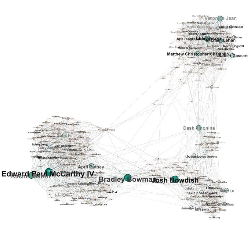
Here we can already see clearly defined clusters without having to performing community detection. In this image there are 3 major clusters. The major cluster in the south west is divided into two sub-groups and the major cluster in the south east is divided into three sub-groups. [A]


High School Cluster [B]
highschool.png
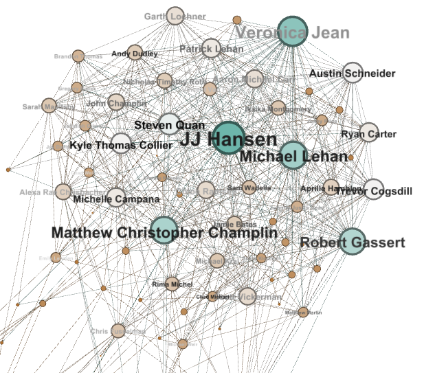
The top cluster primarily consists of friends I met in high school. I grew up with the majority of these people and they all attended Mountain Ridge High School. Outliers around this group include family members and people I have met through friends from high school. [B]


Anime Cluster [C]
anime.png
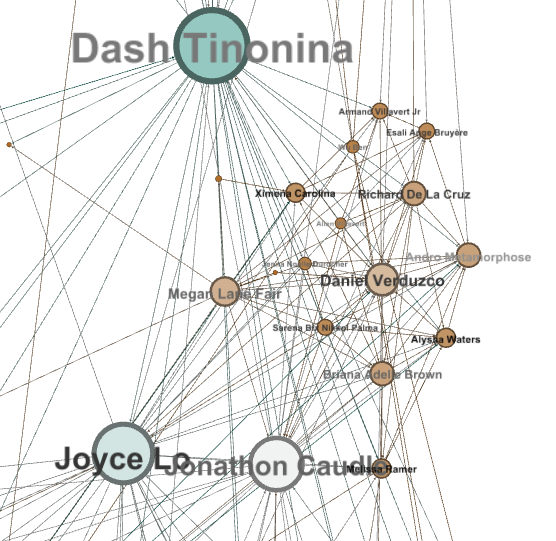
Below that we have a small cluster of friends which I cosplay and attend anime conventions with. Jeff Lam is a cousin of mine who attended Mountain Ridge High School and is friends with many of the people I frequent conventions with. His node is one of the few links between these two community of friends. My girlfriend Dash Tinonina also serves as a link between my high school cluster and my anime cluster. We both participate in cosplaying events within the anime community, and we both hike and camp with my friends from high school. [C]


Dorm Cluster [D]
dorms.png
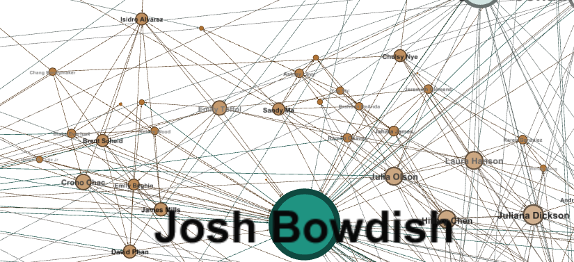
South west of the anime group is another smaller cluster of people I met through living in the U of A Fine Arts dorm and living at the Geronimo House. Many of the people on the right side of this cluster went to Ironwood High School. Josh Bowdish lived in the same hall with me freshman and sophomore year of my undergrad and we have pretty much been living together from 2008-2013. Because he is friends with my anime group, dorm group, and the larger cluster to the southeast, his node has one of the largest diameters on my map. [D]


Drinking Cluster [E]

drink.png
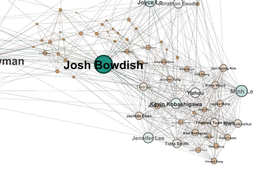
This is the greater southeast cluster. These are all people I’ve met through drinking. Back when Kevin Kobashigawa lived in Tucson, you would be able find people from this cluster at his house Thursday-Saturday night. [E]


Fine Arts Cluster [F]
sculptors.png
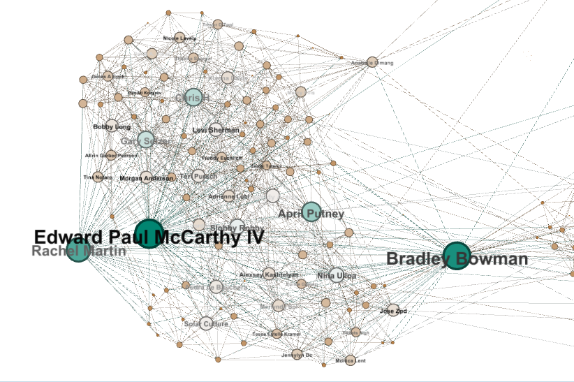
The greater south west cluster is the largest cluster filled with all kinds of creative people from different disciplines. Bradley Bowman lived in the same dorms with Josh and me. He has also introduced me to everyone I know in the southern portion of this cluster making him one of the largest nodes in my network. The southern half of this cluster enjoys Tucson nightlife and is current with the music scene. The north portion of the cluster consists of printmakers, illustrators, graphic designers, photographers, painters, and sculptors. Rachel Martin, Edward Paul McCarthy IV, and April Putney are sculptors I’ve worked with throughout my undergrad who also participate in Tucson’s nightlife and bar scene. It is interesting to see that Anabelle Dimang and I have a mutual friend from Mountain Ridge High School. She is one of the few distinct links between my creative cluster and my high school group. [F]


Gender Analysis [G]
sex.png
Using gender to color code the nodes we can see that the majority of friends in high school were male whereas the majority of my friends in college were female (In hindsight I should have made each node the same diameter for a more accurate visual representation, but it's pretty fun picking out the lead male and female roles in my story). [G]


Modularity Community Detection[H]
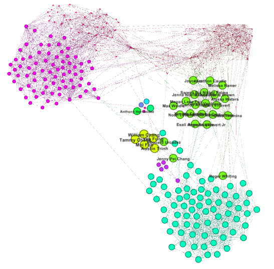
After performing modularity algorithm for community detection we can see several of the same groups we found while using degree as the ranking measure along with some new groups. Some differences between the two maps include splitting up my high school cluster into new groups after the modularity algorithm. To the south in light blue is my high school cluster. Within the same area is a family I used to be very close with in highschool represented by the purple cluster of 5. My own family is above this group in Yellow. There is also a well defined split in the fine arts cluster in this version. The music/night life/ bar scene group is represented by small hot pink dots in the north west right above the rest of the fine arts cluster represented by larger pink dots. I wonder why this version decided to represent the north east area as one group type even though there appears to be distinct sections. This group is represented by the tiniest red dots and are a combination of my dorm group and the group I drink with. It is also curious to see a small peninsula forming on the top left of this section comprised by classmates from my Chinese class. [H]


Betweenness Centrality [I]

Betweenness centrality is the geodesic distance between nodes. In this version of my network It makes sense that Dash Tinonina is the largest node. She is my girlfriend and she is a part of many aspects of my life. She is well aware of the different types of friends that I have in all of my clusters, whereas the other large nodes are more specialized and therefore do not have as high of a betweenness centrality. This is mainly because I met Josh Bowdish, Bradley Bowman, and Edward Paul McCarthy IV at the University and they have little to no connection with my high school cluster. I also met Dash Tinonina at the University, but we visit my highschool friends from time to time. [I]


This social network analysis has been enlightening. I was surprised at how much information could be derived from data I was already aware of. Gephi has also been surprisingly nice and intuitive to use. By using Gephi I was able visualize my social network in different forms making it easy to analyze. The most interesting part about this project was discovering key players and outliers in my map. In the future I hope to perform similar analysis to compare and contrast changes in my network over time.

Monday, March 10, 2014

Web Analytics

Similar to the Business Intelligence life cycle, in web analytics we set goals, collect data, report, analyze, and optimize. Using a web analytics program such as Google Analytics, we can track every action on a website in real time. By setting goals we can begin determining the KPI that are relevant to our websites and then create dashboards and widgets to help us better analyze and understand performance trends.


Recently I've been using Google Analytics to explore http://www.westcoastfix.com/. West Coast Fix is a music blog that focuses on thoughtful in-depth coverage of new music regardless of popularity or buzz factor. All WCF staff members are heavily involved in their own creative outputs and offer a greater context for the topics covered. By providing discourse on deserving music and music related media, WCF sheds light on undiscovered artists and continuously produces meaningful content for its viewers through its interviews and music reviews.

With the goals of the site in mind, I decided to look into where their audience was coming from in terms of audience demographic and in terms of traffic sources. I also looked into which key words were bringing users to the site from search engines such as Google and which types of devices, browsers, and operating systems were being used to access the site. After performing an analysis on the site's content, I was able to determine average page view duration and bounce rate per page.

I came to the conclusion that West Coast Fix is a well designed music blog. Its minimalist interface allows users to effortlessly navigate through content on different browsers and operating systems. WCF provides meaningful content according to its average page duration and average bounce rates. The only advice/critique I have is to bring back the search bar and the about/contacts page. The majority of site traffic flowed through the contacts page and the search bar was convenient. It will be interesting to see how their new site affects user interaction.


Friday, March 7, 2014

Business Intelligence


Business intelligence is centered around performance measurement and management. To measure how well a business is doing we need to first establish key performance indicators (KPI). One way of doing this is by using a performance management framework such as a balanced scorecard which lays out the actions required to achieve specific organizational goals. A balanced scorecard focuses on four aspects: customer, financial, internal business processes, and learning and growth. Traditionally, businesses have often exclusively used financial performance as indicators for organizational growth, but this is misleading because non-financial factors such as customer satisfaction, employee morale, and product performance, all contribute to organizational growth and performance.


After establishing KPIs we quantify these measures and ensure that the data is correctly cleaned and profiled. Data profiling is used to determine if business rules and integrity constraints are being violated. It is vastly easier to perform new application integration and repurpose data sets when data is maintained at a high level of integrity. Poor quality data is worthless and analyzing poor data is a worthless effort. This cleaning process is necessary for proper extraction, transformation, and loading (ETL) into data marts and data warehouses.


Data warehouses are designed and implemented to store all of our records. Analysts will access this data to create dashboards for quick and easy information consumption. Dashboards are visual representations of current and historical KPIs. A good dashboard is designed with a minimalist mindset and is presented in a way which information can be monitored at a glance. I want to stress how important it is to create well designed dashboards because immediate decisions that depend on real time dashboards can have dire consequences. Consider a hospital that uses poorly designed dashboards to monitor its patients or a businessman that uses poorly designed dashboards to monitor stocks.


Ram, Sudha. (February 2014). MIS 587 – Business Intelligence: Dashboard Design and its use for analysis. Lecture Conducted from University of Arizona, Tucson, AZ. Accessed on February 16, 2014 from http://courses.eller.arizona.edu/mis/587/ram/Lecture8/

Ram, Sudha. (February 2014). MIS 587 – Business Intelligence: Data Quality Analysis. Lecture Conducted from University of Arizona, Tucson, AZ. Accessed on February 14, 2014 from http://courses.eller.arizona.edu/mis/587/ram/Lecture7/

Ram, Sudha. (January 2014). MIS 587 – Business Intelligence: Balanced Scorecard. Lecture Conducted from University of Arizona, Tucson, AZ. Accessed from http://courses.eller.arizona.edu/mis/587/ram/Lecture4/

Monday, February 24, 2014

Data Warehouse Design and Dimensional Modeling


Within organizations, information is typically categorized into two different areas. There are operational databases that are used for online transaction processing (OLTP), and there are data warehouses and data marts used for online analytically processing (OLAP). OLTP database users tend to be operational users who enter data or control inventory. OLAP databases are used by analysts and management to support long term decision making.


Online Transaction Processing (OLTP) databases support everyday business operations. The operations of an OLTP database include reading, writing and updating. These basic transactions are current and include data entry and changes made to entities such as orders, customers, inventory, etc. When designing an OLTP database we begin with an ER diagram that consists of Entities and Relationships. OLTP data is stored in relational tables.


Online Analytical Processing (OLAP) databases contain current and historical business data used to show changes in data over time. OLAP databases periodically update and have read only functions that are used for reporting. When designing an OLAP database we use Star Schema comprised of Facts and Dimensions. OLAP data is stored in multidimensional structures such as data cubes.


Ram, Sudha. (January 2014). MIS 587 – Business Intelligence: Data Warehouse Design Cycle. Lecture Conducted from University of Arizona, Tucson, AZ. Accessed from http://courses.eller.arizona.edu/mis/587/ram/Lecture3_v3/

Wednesday, February 5, 2014

Big Data Explosion


The rate at which we are generating data is truly truly outrageous. In 2012 90% of all data in the entire history of data had been created in the previous two years. Currently 2.7 Zetabytes of data exist today and it is predicted that by 2020 the amount of data will be 50 times that of today.

According to the McKinsey Global Institute, it is predicted that 1.8 billion people in developing economies will transition into the global consumer class and an estimated 2.5 billion to 3 billion additional people will potentially be connecting to the internet. As mobile computing devices become more affordable and readily available, it is becoming easier to connect with the world. This explosive rise in users and connectivity will likely drive the development of developing nations by providing huge business opportunities through data. In many cases internet access will be available before access to reliable electricity or water.

With the immense number of internet users networking, purchasing, banking, and socializing, we are in a world where connectedness is becoming extremely pervasive. All data has the potential to be tracked and this has created a gold mine for business analysts to discover trends. Business are able to offer extremely personalized and targeted services, and in some cases too extreme.


Andrew Pole is a masterful analyst. He developed a pregnancy-prediction model while working for Target. Using market basket analyst he was able to determine correlations between products and stages of pregnancy.

There is a case where advertisements for maternity clothing, nursery furniture and pictures of smiling infants were sent to a high school girl. Her father furiously thought that Target was trying to encourage her daughter to become pregnant. He later found out that she actually was pregnant and had not told anyone about it. Her shopping history matched up with trends such as purchasing large quantities of unscented lotion along with calcium, magnesium and zinc supplements. As a male, this makes me wonder if I would still receive the same advertisements from purchasing these types of items.

The response from the public towards predictive analysis marketing is generally negative. It is perceived as creepy and intrusive. Target has since planted non-pregnancy related ads next to their pregnancy ads to appear more random to their pregnant demographic.

“And we found out that as long as a pregnant woman thinks she hasn't been spied on, she’ll use the coupons. She just assumes that everyone else on her block got the same mail for diapers and cribs. As long as we don’t spook her, it works.”


OgilvyOne Worldwide. Big Data for smarter customer experiences. <http://adayinbigdata.com/>

Chui, Michael, James Manyika, Jacques Bughin, Brad Brown, Roger Roberts, Joi Danielson, and Shalabh Gupta. "The Next Three Billion Digital Citizens." Ten IT-enabled Business Trends for the Decade Ahead (2013

Duhigg, Charles. "How Companies Learn Your Secrets." The New York Times. 16 Feb. 2012. 5 Feb. 2014 <http://www.nytimes.com/2012/02/19/magazine/shopping-habits.html>.

Sunday, January 26, 2014

Big data

The internet has brought upon significant changes in everyday life. There is more data now than there has ever been before. The amount of data doubles every three years and today less than two percent of all stored information is non-digital.


Big data is rapidly shifting from internal performance metrics commonly found in transactions and ERP systems to the consumer. Modern day big data is being pulled from social networks such as Facebook and twitter. Due to this shift we are constantly being bombarded by incredible amounts data. We are able to draw conclusions from this data and find unusual correlations not normally associated with information gain.

In many instances regarding big data we are no longer searching for why things happen. This is because debate among causation is less relevant when we can agree on the definitive data for correlation. Often times discovering patterns in big data is enough to understand trends, therefore understanding why something happens is not significant as long we can successfully predict what will happen.

For example, we have been able to predict asthma related hospital visits from certain key tweets based on their location and time stamp. We have also been able to successfully predict traffic patterns to optimize driving routes based on real time data streams from cellphones using current GPS location.


On a related note, the more people participating in free/"freemium" big data services the quicker privacy is eroding. More and more end-users are becoming aware of how convenience comes with a considerable cost of transparency and have mixed feelings about this issue. 

It is common place for apps to ask for access to your contact information, recent calls, GPS location, email, and even to post on your behalf on social media websites such as facebook and twitter. In return you're granted access to their application. For example, Google Now is able to draw information from your scheduled calender events and use real time data on airline flights and traffic conditions to notify you that your flight has been delayed and that there is no rush to get to the airport. Is the information you're allowing google to access worth the convince of the app? Is it ok to let big brother watch over you if it has its benefits?


Cukier, Kenneth Neil & Mayer-Schoenberger-Mayer, Viktor. “The Rise of Big Data: How It’s Changing the Way We Think About the World”. ForeignAffairs.com. May/June 2013. Web. 26 January 2014. http://www.foreignaffairs.com/articles/139104/kenneth-neil-cukier-and-viktor-mayer-schoenberger/the-rise-of-big-data

Ram, Sudha. "Creating a Smarter World with Big Data: Sudha Ram at TEDxTucson 2013."YouTube. YouTube, 13 Jan. 2014. Web. 26 Jan. 2014.

“Big Data Gets Personal”. MIT Technology Review. May 2013.

Tuesday, January 21, 2014

Hello World.

Good morning everyone. My name is Alexander Chang and welcome to my blog. I studied sculpture in my undergrad and received my BFA from the University of Arizona. I am currently a grad student working towards a Master's in Management Information Systems and I'm one class away from obtaining my Business Intelligence and Analytics Certificate.

I work for Johns Manville Alloy Shop and Quality Lab primarily as a Quality Inspector and Data Auditor. In addition to quality, I have a background in safety having operated and managed the wood shop, metal shop, wax shop, and the foundry at the UofA. I have also trained students in safe tool use and several casting processes.

Recently I've been revising the plant's Job Safety Analysis and coming up with database solutions for the company's dated filing system. I hope to learn more about big data management and analytics in MIS 587 in order to gain a better understanding of business intelligence within the context of social networks.

Please follow me at:
Twitter
Facebook